YouTube Red
Design Lead, Manager
2016 - Present
TL;DR
YouTube Red is my latest project at Google. In it my role has shifted into management and hiring as well as helping to craft the vision for the product as it matures; I’m doing less design work day to day. In this case study, I outline:
- When inconsistent design is actually the right design when it came to building a premium product inside of YouTube.
- Adding full motion video and using it to increase the feeling of premium, as well as use comprehension of the content itself.
- New page types that the team designed and implemented.
- Finding a home for YouTube Red under severe constraints.
- Establishing a rigid process and spec for our artwork.
Due to confidentiality I can’t show much of the work that went into this design. I can only show screenshots from the launched product and talk about how we got here.
Context
YouTube Red is YouTube’s first premium subscription service which launched in Oct 2015. It combines premium features on YouTube (like Ads Free and Download), Original Movies and Series, and Premium Music for $9.99/month. In addition to the customer facing YouTube Red product, the team is responsible for all billing and payments infrastructure at YouTube as well as a first party promotion system. Even though YouTube Music is included with the YouTube Red subscription, the Music App is designed by a separate sister UX team.
I joined YouTube Red as Design Lead in June 2016. When I started we had a design team of 2, myself and our UX Researcher. YouTube Red is a horizontal project that literally touches every app at YouTube, which requires me to interact and build strong relationships with other UX Designers and teams across all of YouTube. If these relationships aren’t strong, things don’t get done.
My Responsibilities
Since starting on Red, we’ve grown the UX team from 2 to 5 people. Much of the design work discussed here was done by the designers on my team. Over the life of this project, less of the pixel design work has been done by me. But at the beginning, I was designing screens and building the prototypes that went into the lab, as well as selling the vision to the broader organization.
This case study focuses on the story of that most visible changes for Red Members since the product launched, how we present our premium content to members and non-members.
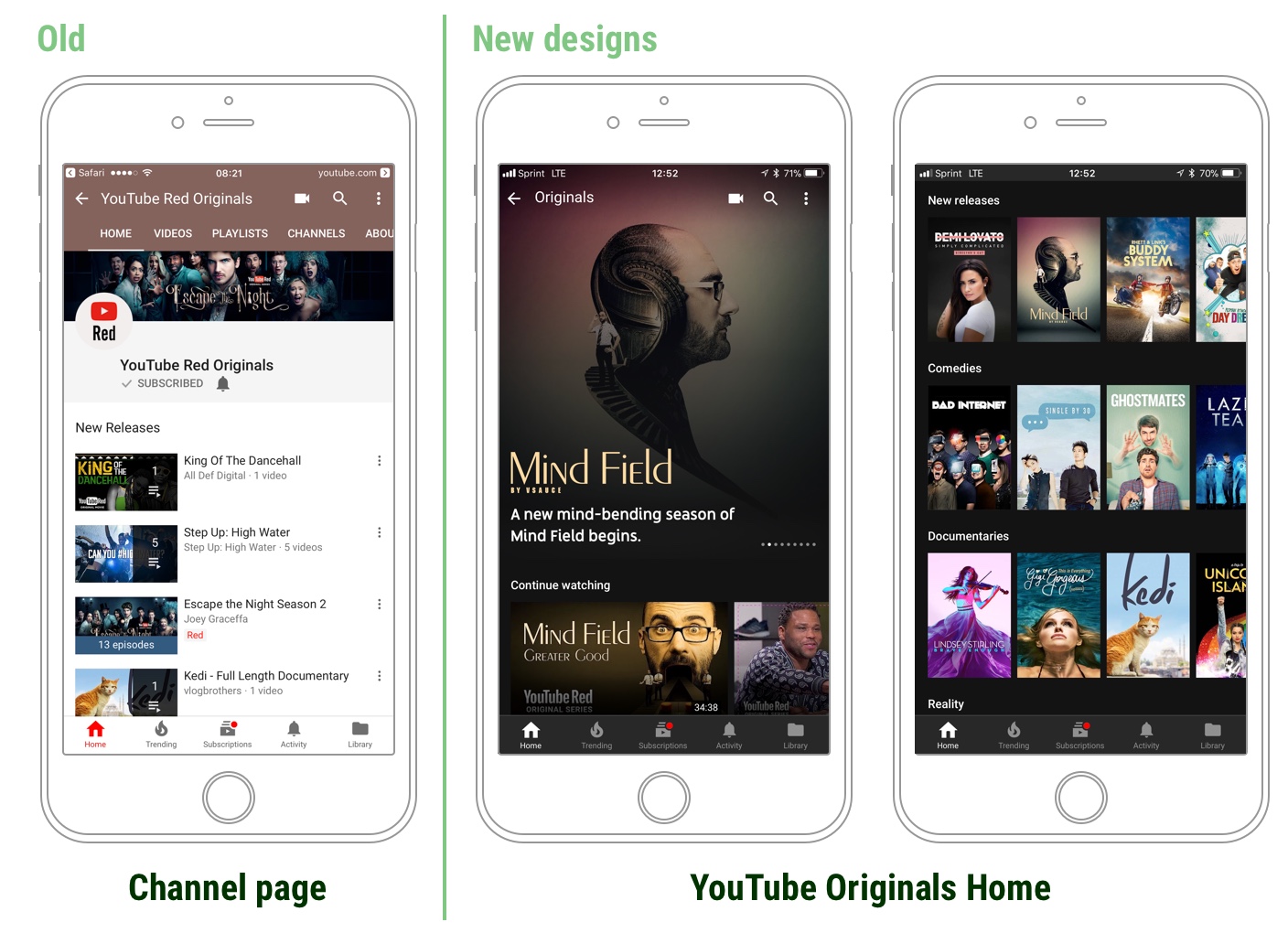
The right experience is inconsistency?!?!
It may sound obvious, but when people pay for something, their expectations change. When Red launched its premium movies and series, it put them onto the platform just like any other YouTube video. After all, YouTube is the world’s #1 video destination and it is great at hosting and playing videos.
Our users wanted an inconsistent experience with the rest of YouTube.
But members weren’t happy about this. They expected the content that they were paying for to be both easy to find, and presented in a premium way. They wanted an inconsistent experience with the rest of YouTube.
So, in December 2016, my team kicked off a project to design a new premium home for YouTube Red Originals Movies and Series, one that solved our 2 major problems:
- The content that I am paying for is hard to find.
- The content that I am paying for doesn’t feel premium (differentiated) from the rest of YouTube.
Bringing full motion video to YouTube
While we were working through this process, I encouraged the designers on my team to explore full motion video as a way to make the product feel more premium. Instead of static thumbnail images with no motion, I wanted them to play with using actual video because I felt like it would differentiate us from the rest of the app and add to the premium feeling. And, in user testing, we discovered another unintended benefit. Users understand a lot more about the content from a 10 second looping video then from a static image, and were more likely to watch the content.
Oddly enough, there was no way inside the YouTube app at the time to play video except for in the YouTube video player itself, and that wasn’t going to work. The YouTube player is a precision piece of engineering and it isn’t designed to be used outside of the watch page.
Our full motion video prototypes and UI were testing very well in the lab. Everyone who saw the demo including Susan Wojcicki, YouTube CEO, loved the look and feel. We used prototypes (built in Principle) more than any other previous project that I had worked on. It was amazing to me how easily designs were approved and how quickly people got excited by what we were trying to do because they could actually touch and feel it.
Adding full motion video to the app was technically challenging for the engineering team, and they had to build new infrastructure to support it at YouTube scale, but it was worth it from both the user benefit and business (key metrics) benefit.
New premium page types, built just for Red

Red was hosting all of their premium content on existing YouTube infrastructure and pages. In a sense, it was using the exact same systems and tools that every other creator on YouTube was using. That meant that all of the content could be found on a YouTube channel called YouTube Red Originals. This channel linked to standard YouTube playlist pages with the content on them which then linked to a standard YouTube watch page.
We knew that these pages weren’t ideal for our content, and we saw in the lab that our members were disappointed by them. We were selling a premium product that didn’t look or feel premium. So we undertook an effort to build new pages to house this content. These pages needed to work well for the type of content that we had (movies and series) and look premium to our users.
Threading a needle to find Red a home
While we were building the new pages to house our premium movies and series, we also needed to find a better way to get users to the content. Unfortunately, we had very serious constraints placed on us by YouTube leadership, “Don’t touch the Nav”. Needless to say, finding a logical home for the content without touching the broader mobile app nav was a difficult task.
After a significant amount of explorations and user testing, the solution that we came up with was to add a new module to the top of the YouTube home feed for members only. Members don’t see ads, so they wouldn’t see the masthead ad that normal sits at the top of YouTube. It would contain three things, 1) a banner that could be used to communicate new content that you might be interested in, 2) a link to the YouTube Music App which was included in your membership, and 3) a link to the new home YouTube Originals.

Artwork driven UI
In addition to video, one of big changes we made to the UI was leveraging show artwork as navigation. We hypothesized, and then proved in the lab that using high quality art would aid in users understanding of this new premium destination. Unfortunately, our show artwork was all over the place, an inconsistent mess.
In order to make this new destination work, we needed to created an artwork spec, determine what formats and aspect ratios we would need, redo artwork for all previous shows, and communicate this information and enforce these new standards with the three different external agencies that produced our show artwork for us. We also needed to coordinate these changes with engineering to build a tool and system to manage this artwork, which didn’t exist previously. And finally, we needed to plan for the future because any changes to these specs would be very expensive and time consuming.
After a few months of back and forth, we were able to standardize on 4 aspect ratios.
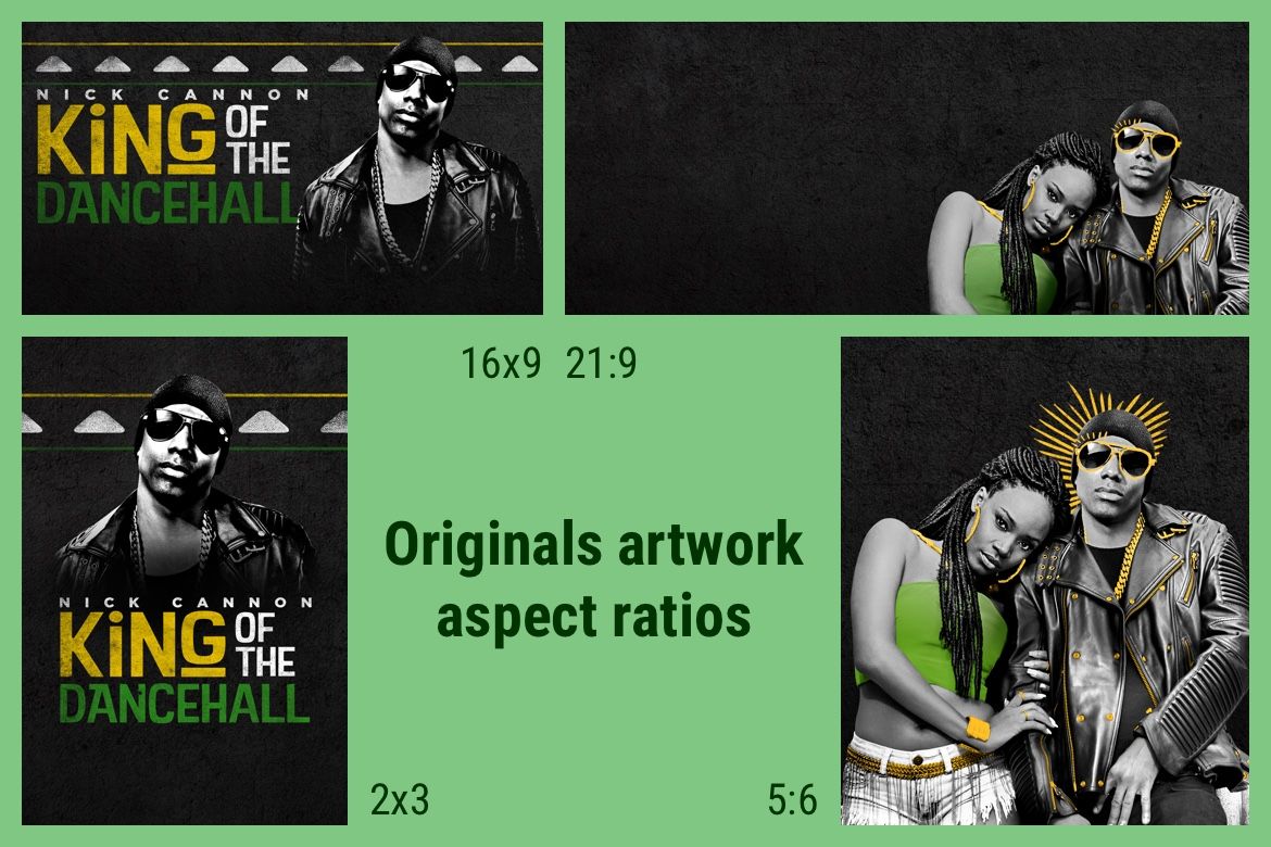
Inside these, we had artwork variations totalling 10 different assets per show, which the system would then automatically resize to whatever size was needed by the app. Two things had to happen to make this successful. The first was a review process for all artwork from the agencies in order to ensure the assets were correct. The second was an agreement by the UX team that we would use the artwork in the specs for our UI surfaces, not change sizes or requirements since any change would force us to go back to every movie and series on the platform.